Developing websites for mobile devices is not a new concept. The BBC have been doing it for years and years. We at IMRE also worked on such a project way back in 2006. (See our blog post : https://www.imre.uk/2012/06/responsive-design/ )

What has really changed is the ethos and the mentality behind what and how things should be done. Previous thinking required that websites were duplicated and fine tuned to work on mobile phones. If a new format came out then you had to create another version of the website. So in reality you could find yourself in charge of 3 or 4 websites all containing pretty much the same information but were adapted to show content in different ways. This was a huge waste of time, energy and effort. But you could not stop there, you then had to consider the potential penalties that you could incur if Google thought that you were trying to push duplicate content.

This is a good explanation for responsive web design : http://johnpolacek.github.com/scrolldeck.js/decks/responsive/ , but be warned, this is a single page website that scrolls and scrolls

Right back to our project. The client is Technical Support & Systems Ltd of Watford and their website is www.uk-tss.com
If you have an iPad or iPhone you can simply have a look at the client website and then try flipping the device from vertical to horizontal. You will see how the content stretches to fit the screen width.
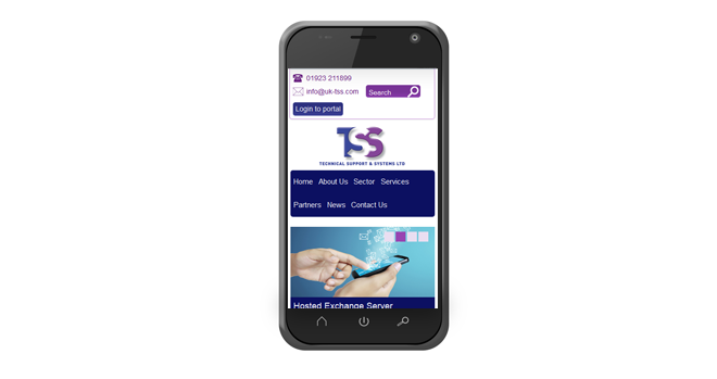
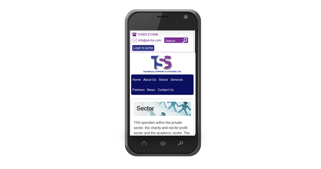
These screen shots will help to illustrate what we mean.


